How to Pick the Right Chart Type for your Data
You have the right data, the next step is to pick an appropriate chart type to visualize the data. Picking the right chart type depends on exactly what you're attempting to show:
- a relationship between categories
- a distribution along one variable
- composition of different variables
| Chart Type | When to use |
|---|---|
| Metric Chart | Best to show a single value that's either increasing or decreasing. |
| Column Chart | Best to show differences between categories. |
| Bar Chart | Best to show differences between categories, with longer labels. |
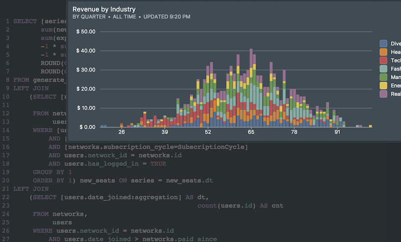
| Stacked Column or Bar Chart | Best to show differences between sub-categories, and better than pie charts. |
| Pie Chart | Can show proportions of a whole, but use stacked column or bar charts instead. |
| Line Chart | Best to show changes in continuous data (such as time.) |
| Scatter Chart | Best to show the relationship between two series of data. Also called an XY chart. |
| Bubble Chart | Best to show relationship between three series of data by using bubble size and color. |
| Map Chart | Best to show geographic spread of your data. |
Next Generation SQL Data Analysis
Write SQL, visualize data, and share your results.
 Onboarding forward-thinking teams now:
Onboarding forward-thinking teams now:
No spam, ever! Unsubscribe any time. Learn more about the product.