First steps with Silota dashboarding and charting
Welcome to Silota! You've succesfully established a connection to your database and now you're ready to proceed.
When you first login, Silota will present a handy screen that allows you to quickly create dashboards, adhoc queries and shows you a handy list of your existing objects like dashboards, queries, workbooks, etc.
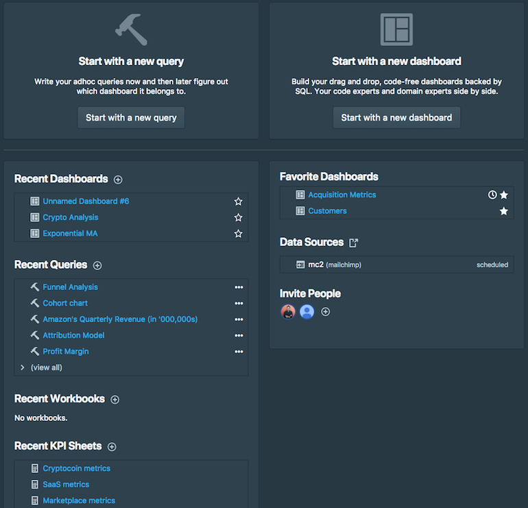
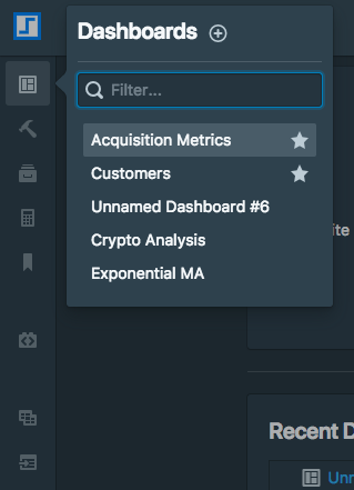
You also have a navigation bar on the left side of the screen that allows you to jump between dashboards, queries, materialized views, etc.
1. Your first dashboard
Silota is made up of dashboards and charts. A dashboard can contain multiple charts and each chart is backed by SQL.
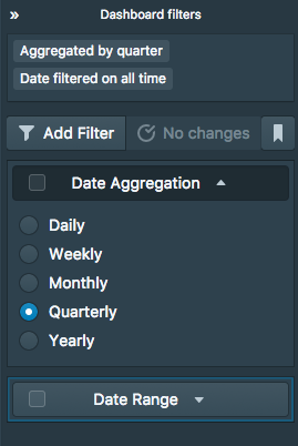
A Silota dashboard organizes charts on a 2-dimensional grid, allows you to create custom dashboard-wide filters to create user defined slices into the dashboard, bookmark these filter values and setup scheduled reports to be emailed or sent to a Slack channel.
You can create a dashboard by clicking "Start with a new dashboard" or using the navigation bar popup. Once you create a new dashboard, you are presented with an empty dashboard.
![]()
From here you can add new charts, configure the dashboard via the drop-down button or configure dashboard-wide filters. Expanding the dashboard sidebar shows you the existing dashboard filters:
2. Your first chart
Once you click "Add new chart" you will be navigated to the chart editing screen. You'll be spending a lot of time on this screen, so make sure you get well acquainted with it.
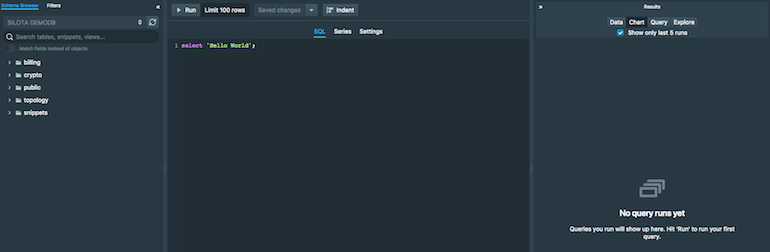
This screen has a couple of key sections:
- schema browser that shows you your database schemas, tables, views. Additionally you can switch between the databases (if you have connected more than one), and search for objects based on name. It also shows you SQL snippets if you have any.
- filters that allows you to see how your dashboard-level filters modify this chart
- SQL editor where you write your SQL
- revision history see past saved changes and revert to a previous version if necessary
- series configuration configure the segmentation columns, data types, etc.
- chart settings pick the kind of visualization, name the chart, etc.
- results pane where you can see the results of your query runs in a spreadsheet style format, export to CSV/XLS, chart and visualize it, see summary statistics, etc.
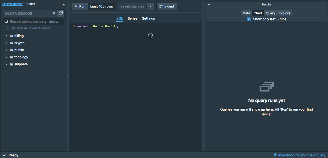
3. Running your first query
When you click "Run", you should be able to see your query results right away.
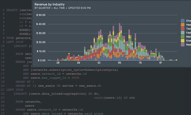
4. Success: Dashboard is ready
When you navigate back to the dashboard screen, you should be able to see your first chart!

 Onboarding forward-thinking teams now:
No spam, ever! Unsubscribe any time. Learn more about the product.