Pie Charts
Overview
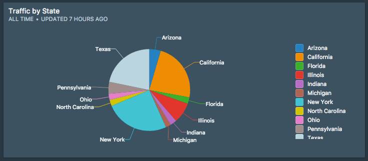
A pie chart is a circular chart divided into slices, each slice is proportional to the quantity it represents. Together, the sectors creates a full disk.
Data format
To generate the pie chart seen above, your data needs to be shaped like this:
| Label | Value |
|---|---|
| Indiana | 843393 |
| Florida | 842583 |
| Pennsylvania | 1553165 |
| New York | 8405837 |
| Illinois | 2718782 |
| California | 7729632 |
| Texas | 7215169 |
Customizations
- Hide Legend
- Hide Legend on Single Series
- Preserve Sort Order
- Show Values in Legend
Best practices for using Pie Charts
Pie charts have a bad reputation – it's too easy to present misleading information. These best practices are meant to make a pie chart visualization each to understand and comprehend for the end-user:
1. Make sure your data adds up to 100%.
Silota automatically adds up your slices so that it sums to 100%.
2. Use distinguishing colors.
Each slice represents a different facet of your data. You shouldn't be picking colors that are too close to each other.
3. Avoid too many series.
Have a max of 4 distinct series and sum up the rest into an "Other" category.
4. Sort the slices by sizes.
Sort the series by the proportional sizes. Makes it easy to scan.
5. Don't make the chart 3D.
We don't support 3D charts in Silota, so this point is moot. :)
 Onboarding forward-thinking teams now:
No spam, ever! Unsubscribe any time. Learn more about the product.