Mixing Map Types and Segmentation
You are not limited to a single map type or a single segment – you can mix and match.
For this example, we'll use a list of the fastest growing companies in the United States.
The data table is formatted as:
| lat | long | employees | state |
|---|---|---|---|
| 34.040926 | -118.465083 | 227 | California |
| 34.040926 | -118.465083 | 191 | California |
| 38.8964 | -77.0487 | 145 | Virginia |
| 37.2751 | -121.8261 | 62 | California |
| 42.3605 | -71.0596 | 92 | Massachusetts |
| 44.1004 | -70.2148 | 50 | Maine |
| 37.6558 | -122.405 | 129 | California |
| 33.525009 | -112.109878 | 130 | Arizona |
| 45.5286 | -122.663 | 264 | Oregon |
| ... | ... | ... | ... |
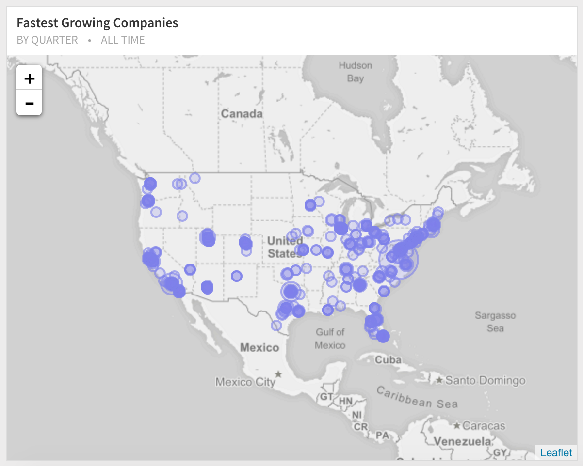
A single series (no segments)
Without picking any segments, the geomap is visualized as before (we've picked bubbles as the map type and weighed the bubbles based on the number of employees.)
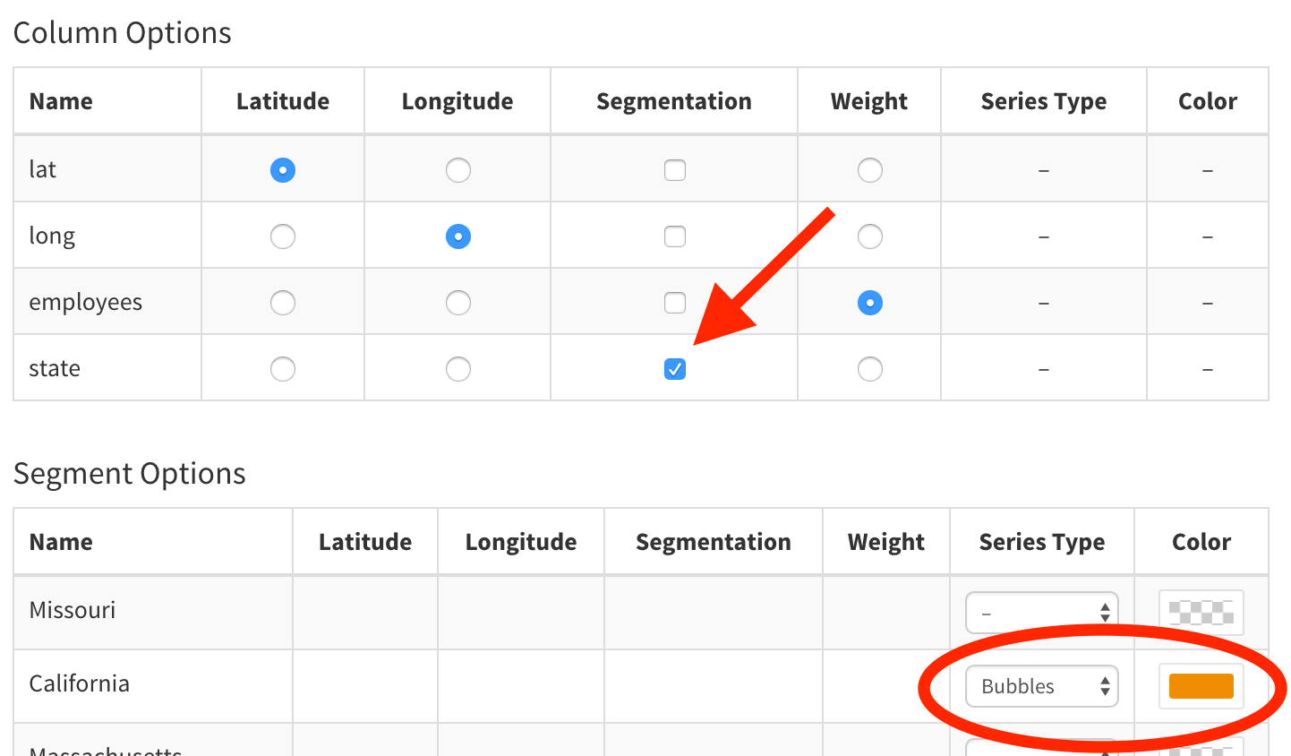
Picking the column to segment on
If you go over to the Series tab, you can pick the "State" as the segment column. Right away the data is segmented and the segments are displayed below.
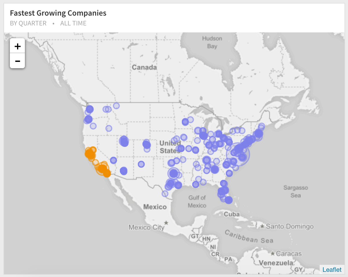
You can further pick a color and the map type for one of the segments. In this case, we'll continue to use bubbles, but change the color to orange.
Final result
Next Generation SQL Data Analysis
Write SQL, visualize data, and share your results.
 Onboarding forward-thinking teams now:
Onboarding forward-thinking teams now:
No spam, ever! Unsubscribe any time. Learn more about the product.