Metric Charts
Overview
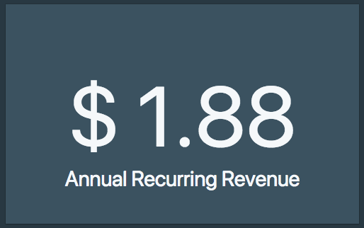
Metric Charts are used to display a single key metric.
Data format
To demonstrate how metric charts work, we'll use this sample query:
select sum(revenue)
from sales;
This would show the sum of revenue as the KPI. The value is always the last non-null value if there are multiple rows in the result set.
Customizations
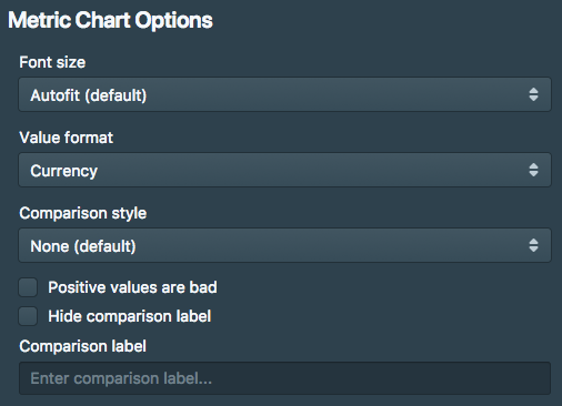
- Font size: you can pick between autofit, large, medium and small.
- Value format: auto, number, percentage, currency.
- Comparison style: show as value, show as change, show as progress bar, show as progress bar (percentage)
Metric comparison
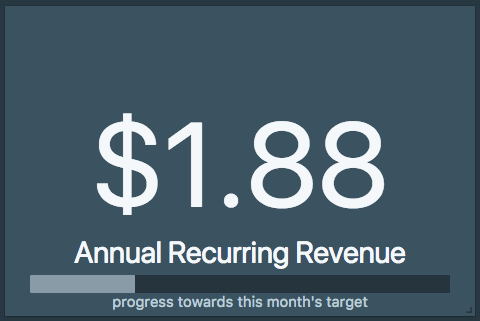
If your query has multiple rows, you can change the visualization to a comparison between the last two points. You can further change the comparison to a percentage, show a progress bar, etc.
Next Generation SQL Data Analysis
Write SQL, visualize data, and share your results.
 Onboarding forward-thinking teams now:
Onboarding forward-thinking teams now:
No spam, ever! Unsubscribe any time. Learn more about the product.