What does it take to succeed in business today? Increasingly, one of the most important skills you can have is analytical skills. And that’s exactly what we are going to share in this post – teach you how to analyze lots of data and tell a story in a quick and interactive way.
1. Motivations & Setup
You got your hands on a CSV file you want to analyze. The CSV file could come from any number of sources: your CRM, your payment processor, or in the example we are going to present: Google Adwords.
Manually creating formulas, organizing and arranging data to show a summary would take hours, introducing errors and reducing accuracy along the way.
With a few clicks, a pivot table will reduce the chance of errors and increase efficiency. A bonus point is that you’ll be able to create beautiful charts to visually present your analysis!
The only software you need for this exercise is Microsoft Excel, or Google Sheets which is free. With a few basic steps you will be able to glean insights from your CSV, build an interactive dashboard and present it to management and prospective employers. Your peers will be impressed!
Let’s get started!
2. Introducing Pivot Tables
Pivot Tables is the single most powerful feature that any modern spreadsheet application like Microsoft Excel has built in. Mastering pivot tables will take you from an intermediate Excel user to an advanced data analysis professional.
A pivot table is a special type of summary table that’s unique to spreadsheets like Excel. Pivot tables are great for summarizing values in a table because they do their magic without making you create formulas to perform calculations. Pivot tables let you play around with the organization and arrangement of the summarized data. It’s this capability of changing the arrangement of summarized data on the fly by simply rotating row and column headings that give pivot tables its name.
3. Key Components of a Pivot Table
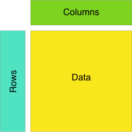
Pivot tables converts large flat tables into a multidimensional table – essentially giving it depth. With this depth, we are able to sort and consolidate data in useful ways.
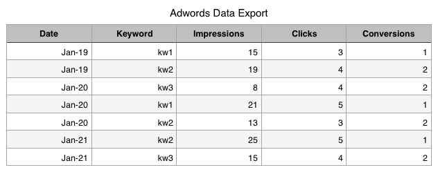
To dig deeper into the components of a pivot table, let’s consider a flat data table like the following, which might be from your Google Adwords marketing campaign. You can generate such a CSV file by exporting your performance data from the Google Adwords dashboard.
3a. A Schema for the Data Table
The columns of the table are self-explanatory: for each keyword, you have impressions, clicks and conversions. This format is repeated each day for the exported date range.
You might have questions about your data such as:
- keywords with the most impressions
- days with the most impressions
- total impressions for a day
All of these questions can be answered by a Pivot Table!
3b. Rows, Columns and Aggregations
Given the set of data table columns:
- Date
- Keyword
- Impressions
- Clicks
- Conversions
You’ll have to pick table columns that go along the:
- rows of the pivot table
- columns of the pivot table
- the aggregation to use amongst the numerical values of the data table
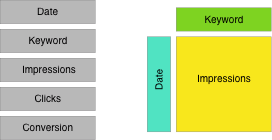
For this specific example, let’s use
- The Date column for the rows of the pivot table
- The Keyword column for the columns of the pivot table
- The Impressions column for the data of the pivot table
- additionally, let’s SUM up the impressions (you can also COUNT, or take the AVERAGE)
4. Your first Pivot Table
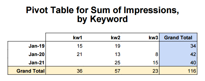
First, let’s present what a pivot table looks like before creating one.
A few clicks, and voila! The pivot table as seen above neatly summarizes our impressions for a given day and for a given keyword. If we scan along one of the keyword columns, we can see how it’s performing over time. Scanning along rows tells us how each keyword performed for that day. Scanning along the totals lets one compare keywords or across dates.
Quite useful!
4a. Creating a Pivot Table
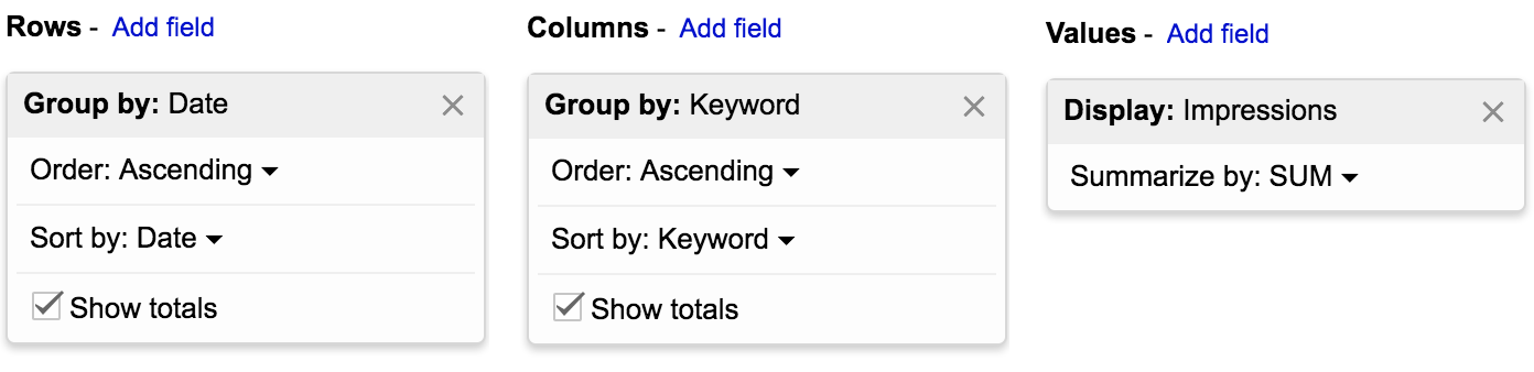
In Google sheets, you can click “Pivot Table” option under the Data menu item. You will be presented with an interface like the above. Simply pick the required rows, columns and values to create the pivot table.
5. Visualization & further thoughts
Hopefully our graphical explanation of how Pivot Tables are constructed was useful. We have much more to say about Pivot Tables, including filtering and visualization which we will explore in a future post.
Image Credits: Unsplash